

Purdy Meyers Identity
Logo Design
Color Selection
Typography
Brand information:
The voice of Purdy Meyers is class. With a healthy jigger of sass. Sophisticated and refined, yet approachable, knowledgeable and always fascinating. Engaging with PM is like sitting down at your favorite cocktail lounge for a well-deserved crystal-cut glass of whatever makes you sink into the well-worn leather chair and say, “Ahhhhhh, life is good.”
Far beyond the bar, we’re curating a Cocktail Community.
A lifestyle of the finest in travel, entertainment, literature, decor, cooking and whatever appeals to our boundless sense of adventure.
So raise your glass, and your expectations. The time is right for Purdy Meyers.
Logo Design
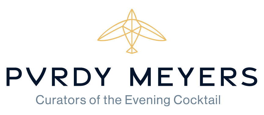
The Purdy Meyer logo was inspired by cut glass, a staple in the world of craft cocktails and luxury bars. These shapes were turned into a bird in flight, representing the sophistication, precision, and discerning but elegant nature of the brand. These same shapes were also used to create a unique and custom work mark completely unique to the client.

How the shapes translate to the custom wordmark

The ratio and build of the primary logo
To keep the brand clearly represented in a variety of use cases, it has a responsive suite containing the logo without the tagline, just the work mark, and breaking it down to a symbol and a favicon monogram.
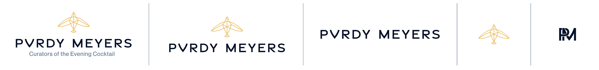

The symbol can also be used in a more graphic approach, clearly showing the cut glass influence and bringing in more detail to the bird.
Color Selection
The Purdy Meyers color palette color palette is designed to embody the sophisticated yet approachable essence of the Purdy Meyers brand. The deep Midnight blue evokes the calm of an evening sky, while Golden Hour yellow brings the warmth and richness of a fine cigar or a pour of whiskey. These primary colors represent the core values of the brand, complemented by lighter supporting tones to create a balanced, cohesive palette.
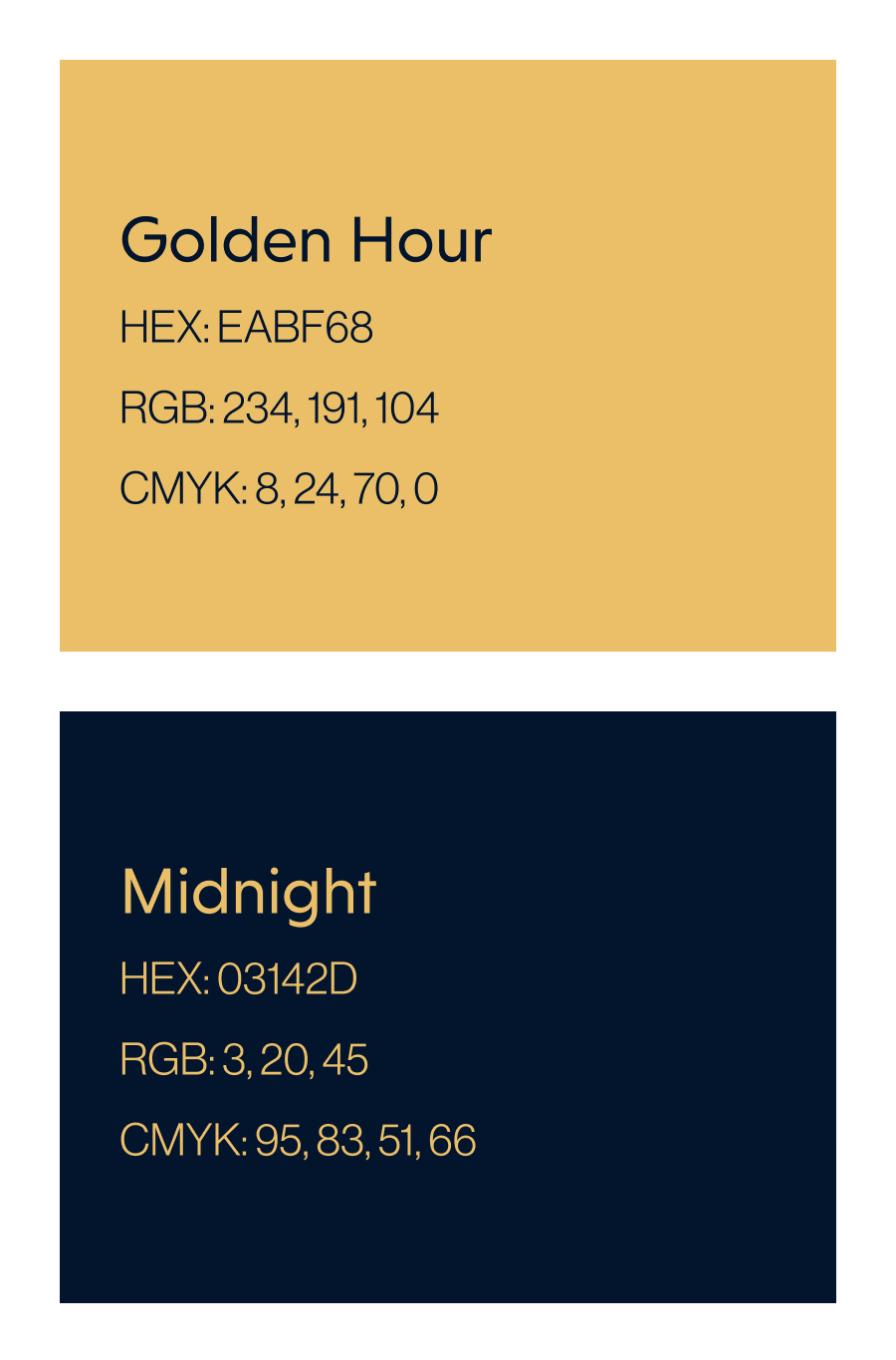
Primary Colors
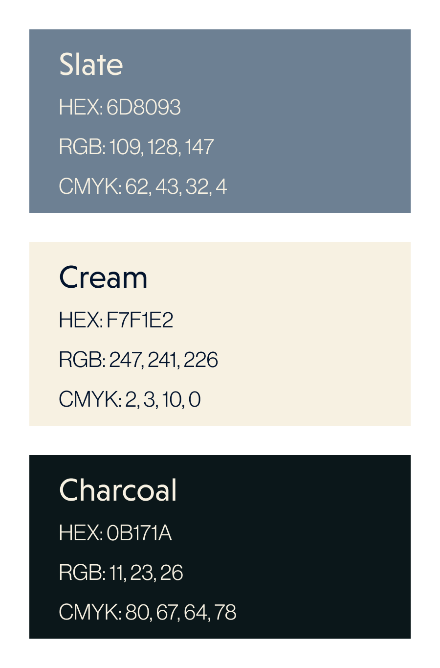
Secondary Colors
Typography
Purdy Meyers has two faces, one for display and one for body text. Both were selected to work specifically in Squarespace.
The Display typeface (Niveau Grotesk), reserved for headers and prominent text, features unique characteristics that add personality to our typography. Its sparing use allows for bolder, more expressive shapes that visually capture the brand's distinct voice. This is balanced with the Body Text typeface (Neue Haas Grotesk), designed for easy readability in longer sections of copy.
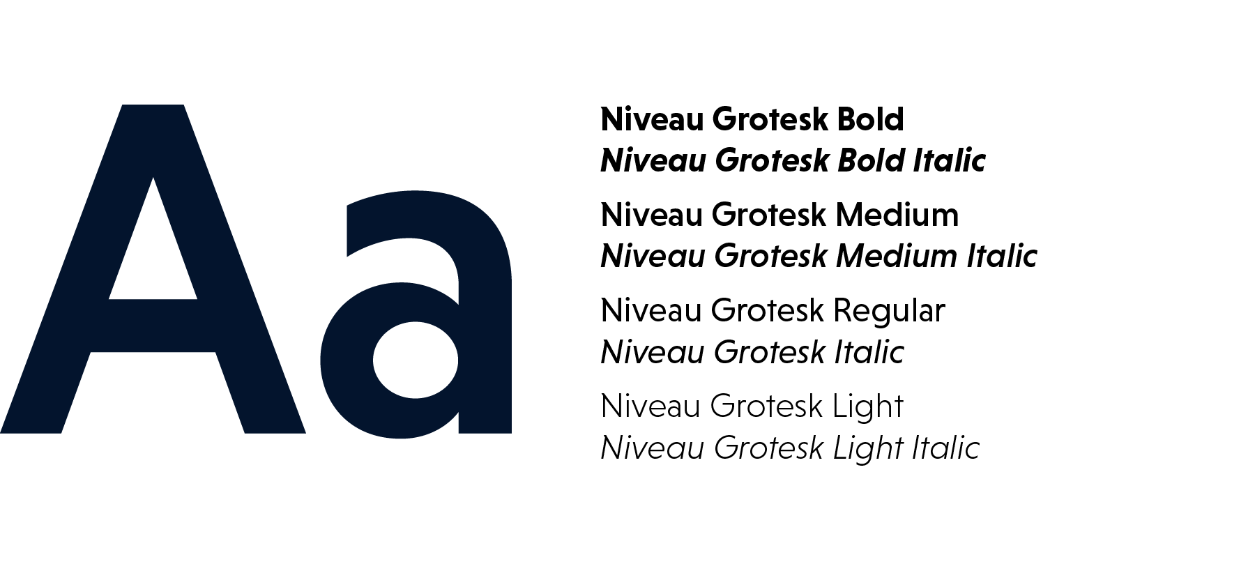
Niveau Grotesk - PM's Display Typeface
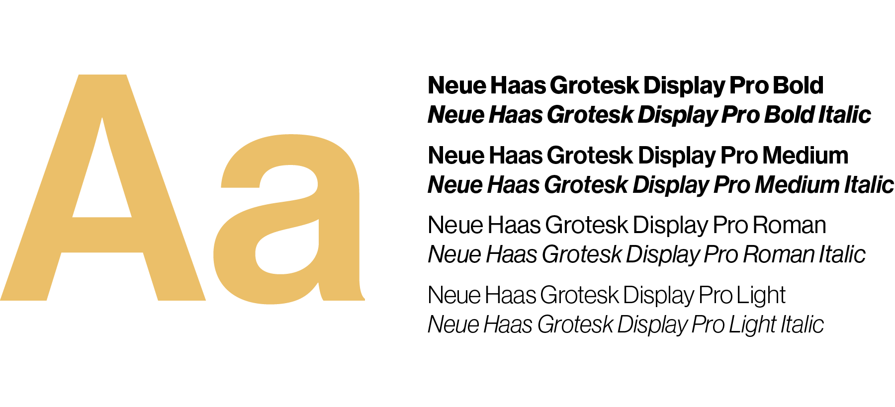
Neue Haas Grotesk - PM's Body Text Typeface
To the right, you'll see an example of the typeface usage and how the typefaces compliment each other.
To keep consistency of the type and an ideal size ratio, type sizes are adjusted with the golden ratio (1.618).

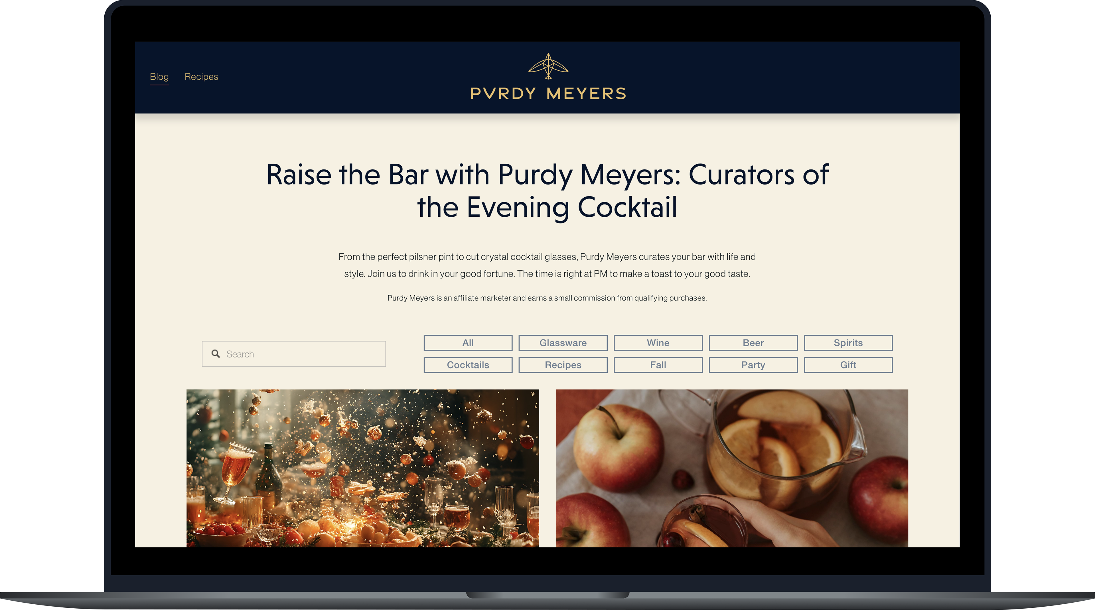
The Purdy Meyer's website in current branding