Simple Brand Identity
*In collaboration with Wit & Craft
Color Selection
Typography
Brand information:
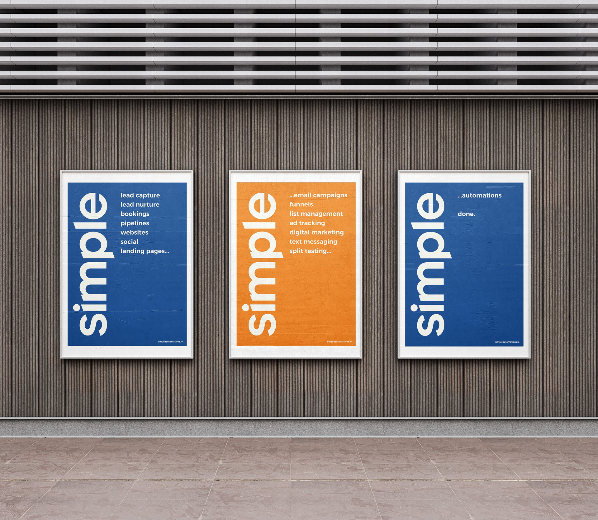
This CRM software company, also known as Simple Automations, wanted a more modern and approachable brand identity. They envisioned a clean, no-frills design that showcased their expertise and built trust.
The goal of this entire project was to keep the identity similar to the program itself — Simple.
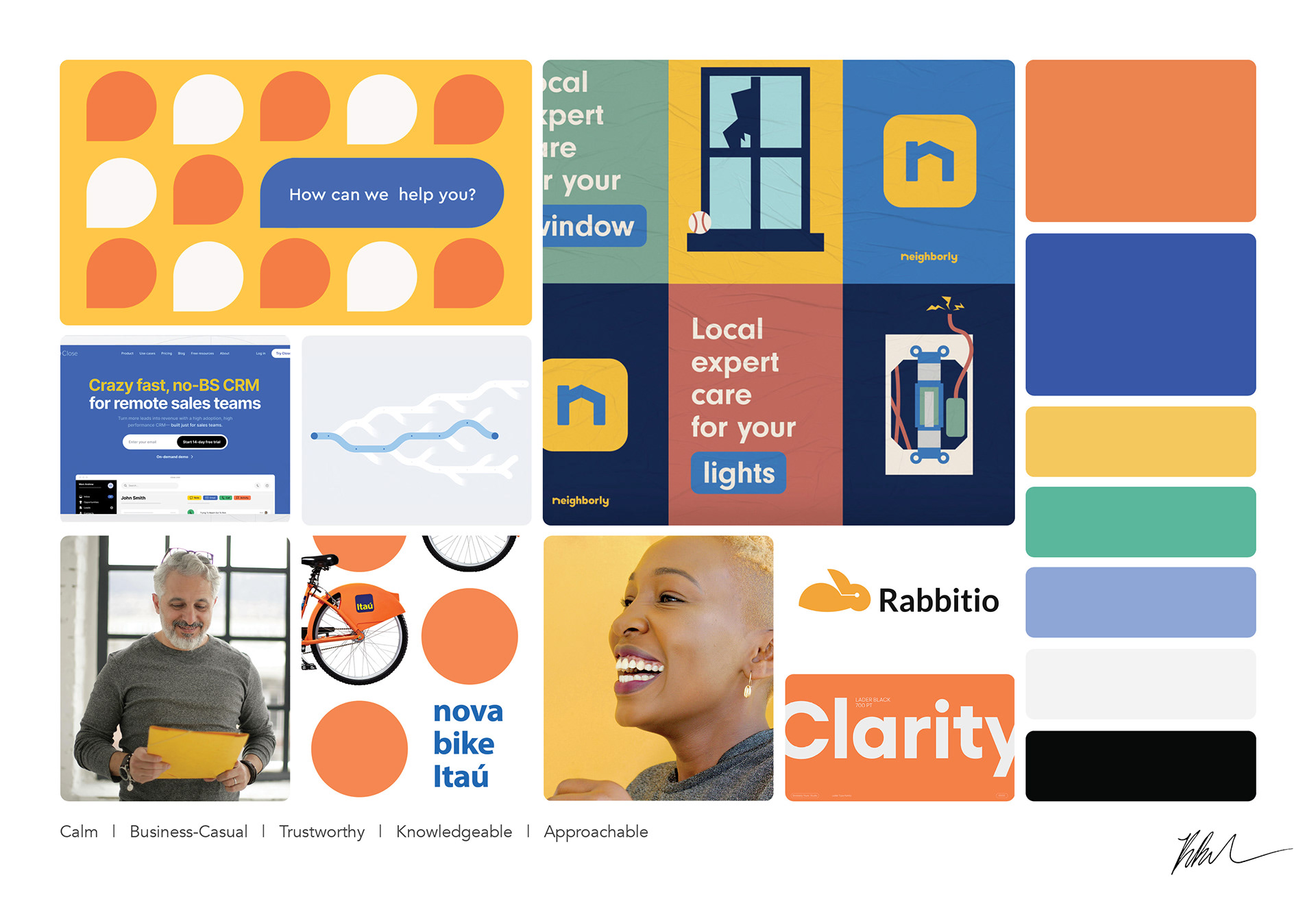
Inspiration Board
This inspiration board was created based off of our discussions with the client on what they were looking for, as well as the company's personality traits: calm, business-casual, trustworthy, knowledgable, and approachable.
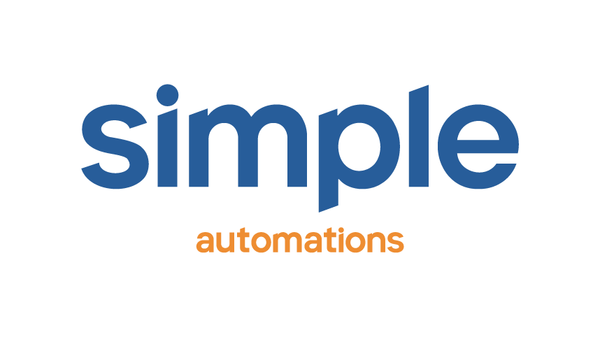
Logo Design

The logo design was created by Jon Czeranna at Wit & Craft.
With adjusted angles to the letter forms, this wordmark is truly unique for Simple's visual identity.
Color Selection
Simple's colors are impactful in meaning and purpose, unique to their competitors, inspiring confidence and optimism in a friendly and approachable way.
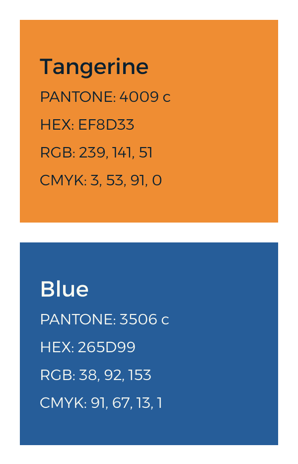
Primary Colors

Secondary Colors
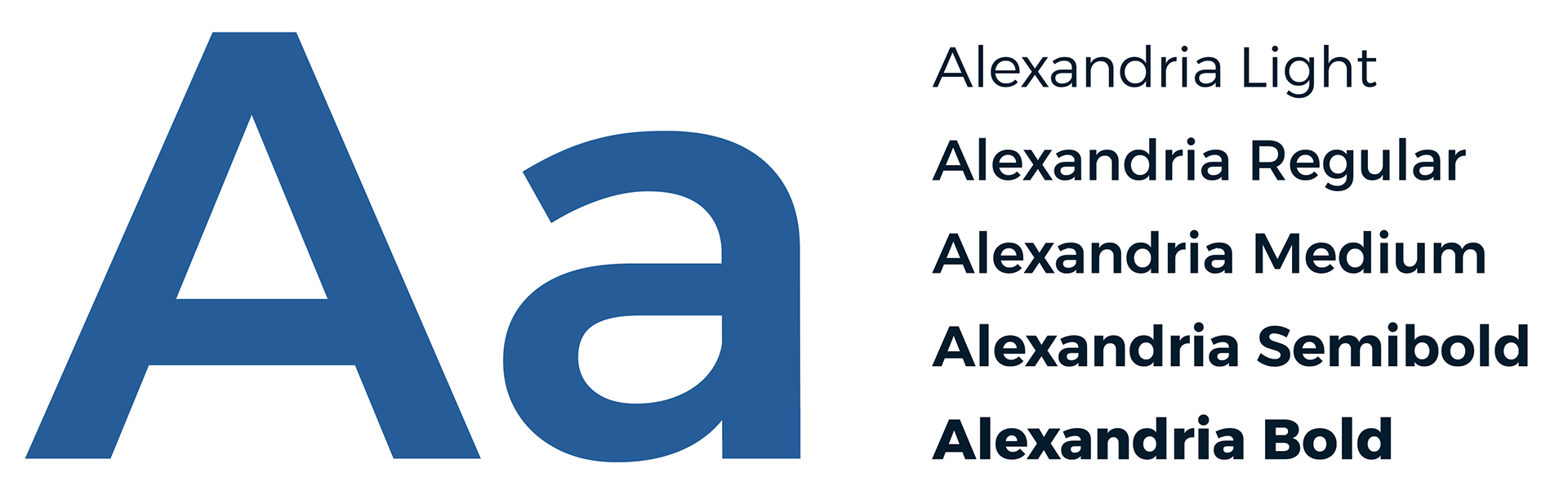
Typography
Simple has one typeface, Alexandria. This typeface is a google font chosen for it's simplicity, ease of access, and how it complements the shapes in the logo.
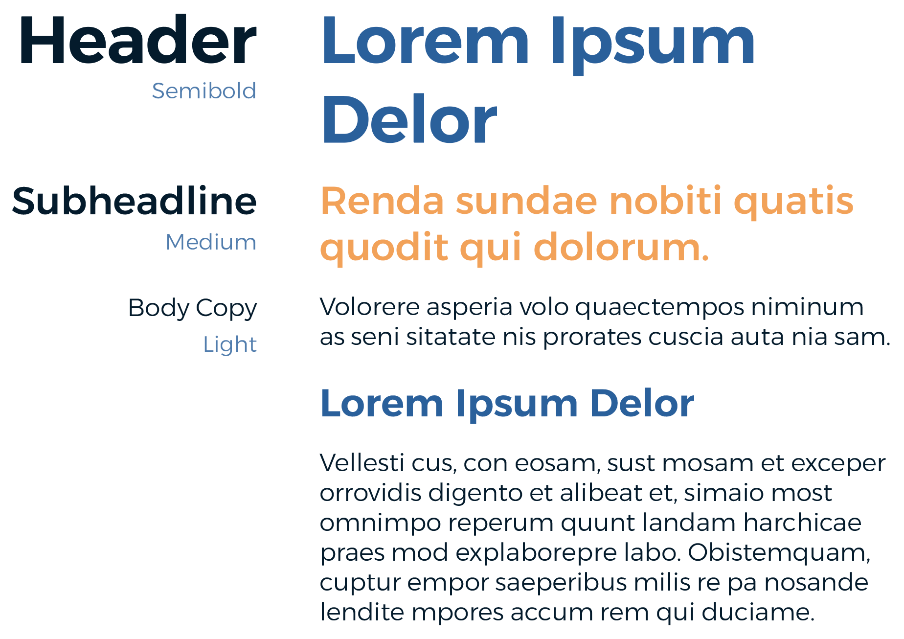
Below you'll see an example of the typeface usage and different styles of the typeface.
To keep consistency of the type and an ideal size ratio, type sizes are adjusted with the golden ratio (1.618).

Animated in After Effects